While this new design is refreshing, it’s just making the context menu slow, and needs improvement. Microsoft noted it to be a padding issue and is working on it. The updated version includes the original context menu, with a better design for speed.
Windows 11 Context Menu
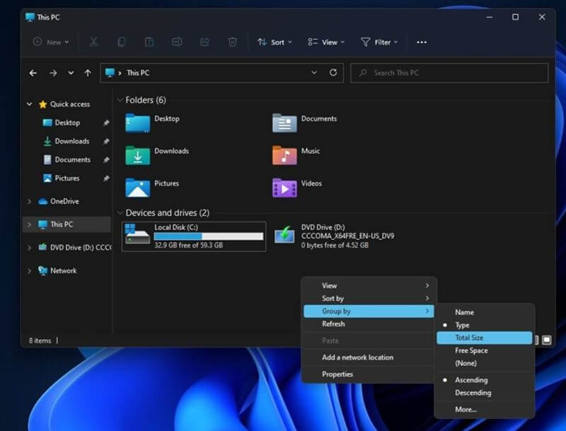
Windows context menu, or popularly the right-click menu or pop-up menu is an essential feature for power users. Opening the context menu shows a number of shortcut functions applicable for a file, which just makes the work a lot easier. Also Read- MSEdgeRedirect – Tool to Block Edge Browser as Default in Windows 11 And since it’s an integral part of the Windows OS, Microsoft decided to retouch it with a new design too. And it’s great now, except for the speed. The all-new context menu in Windows 11 categorizes functions and replaces basic features like cut, copy, paste, rename with icons. And instead of showcasing the whole available options in one go, it hid minor functions under the “Show More Options” button. Clicking this will open the classic context menu. While this is fairly being helpful, Windows power users note a slight lag in its operation. In Windows 11 version 21H2 (Build 22000), users observed the slow response of the modern context menu, which is lagging their workflow. And as they cried in Microsoft forums and feedback sections, Microsoft heard them and is finally coming with a requested fix. This is by revamping the design of the Windows 11 context menu, to make it faster and more helpful. As seen in the latest Dev build of the Insider channel, Microsoft is testing the new context menu, which opens the classic style context menu when right-clicked on any file in the Explorer. It also supports the blue accent color while selecting functions in the menu, just like in Windows 10. This is fast and looking better, but don’t know when will be coming to the stable channel.

